Showing posts with label planning. Show all posts

Monday, 17 April 2017

Pro's and Cons of Working in a group :

Working within a group:

Initially I thought working within a group might have a lot of difficulties especially in the planning stage because I thought that we'd all have varied opinions and that it would be hard to make decisions. However, I was completely wrong, Working within a group actually sped up this process because we combined our ideas and discussed our thoughts until we came to something we all agreed on. As well as this, we were able to share out the work and rely on each other to get things done. This was particularly successful in the research stage because we could all look into different films and feed our ideas and findings back to one another.

I think the main issue that we faced whilst working in a group was trying to fit in shoots around our schedules so that we could all be present, The only solution that we created for this, was that we all came to an agreement that at times we'd have to shoot in pairs, which provided us with more time that we could shoot in. We also faced issues when it came to making cuts and removing certain shots because the group would be divided at times in terms of our opinions. However, This was resolved by there being two people present at all times when the sequence was being edited. This prevented one person from being in control of the editing and helped to create more ideas of how it could be edited.

Overall, I think working in a group was successful, any disagreements were always resolved and we were all flexible to create new ideas and change aspects that didn't work.



Tuesday, 11 April 2017

My opinions:

My personal opinion on the product so far:

I think since the location change has improved the title sequence a lot. The shots of the white screen contrast really nicely against the colours in the house and this helps to separate the two different locations to make it clear that it is cutting to and from her getting ready and then to her actually seducing this man.

There are scenes that I am not content with such as the mid shot of the lipstick being tapped and chosen . This is because it appears too slow and uninteresting and it doesn't really have relevance within the title sequence since we were in able to isolate the colours in the black and white shots. Therefore, the colour of lipstick that she chooses isn't visible. As well as this, the lipsticks don't fill the frame, so I think for this shot to have worked there would have needed to be more then 5 lipsticks. However, I think the topography was incorporated excellently in this shot.

I also think the blood dripping shot shouldn't be included since that was the very first time we shot and the lighting was uneven. Moreover, it doesn't demonstrate our abilities since it hasn't been perfected and re-shot like the majority of the other scenes. However, it is still a group effort. Therefore, as a group we need to decide whether or not these shots should be included in the final piece.


Monday, 10 April 2017

Typography Chosen:

The typography that we have decided to include are:


The opening credits/cast member names:


  The company name:

The film title: 


The sound chosen:

The soundtrack we have decided to use is Quirquincho. It is quite simplistic. However, it has a dark undertone which helps to signify the thriller genre. we will have to adapt the soundtrack in  terms of the speed in order for it to sync in with the visuals. We feel this is the better option over Gordo Jose, which we were considering, because the sound of the drums are a lot less prominent.

Sound Poll:

The Sound Poll:


The poll concluded that the soundtrack we should use is Quirquincho because this was the most popular out of he sample of people that we asked. 

Sound:

We found an artist that has copyright free songs. We decided on four songs of the songs by that artist that we think fit the genre of the title sequence well.

These are:

-Gordo Jose

-Quirquincho

-Gracias


As a way to decide between these four songs and which one should be the soundtrack, we're going to conduct a poll in which people can choose the song that they feel is the most suited for the title sequence.

Wednesday, 15 March 2017

Sound Brainstorm:


Overall, we concluded that we wanted the sound to be of the Jazz genre because that will allow it to be quite seductive and classy. However, we want to find a soundtrack that can create suspense and can be suggestive of the dark attributes that the protagonist has. We need to be careful in picking our soundtrack to be certain that it is copyright free.

Changes made to the narrative:

Changes made to narrative:

After discussing as a group about the difficulty we have had shooting the ending scenes. We have decided to change the narrative of the title sequence and the location. We had previously wanted the title sequence to show the lead female and the male victim going to a bar where they will share drinks and she will spike his. We had tried to set up two locations as a bar, due to us being under age and unable to film in an actual bar. However, both times were unsuccessful for numerous reasons whether it being the ability of the camera, the lighting or the Mise-en Scene. Therefore we have opted to change the narrative.


We will once again be using Maddie Hodge's house to film in. However, this time it wont be set up as a bar, it will be used as the protagonist's home. She will initially take him into the kitchen where she will pour and spike his drink, then he will be lured upstairs where he become disorientated and die. The location is quite colourful but it is still sophisticated and the sizes of the rooms will be good to work with. As well as this, the house is quite open and the kitchen has window panels in the ceiling. Therefore, we will be able to shoot using high- key naturalistic lighting.


Death Scene shoot 2


The Props we used:


We re-shot using the Drama Room in the Art Department. It was quite a low lit room with black walls. We set up a table against the wall and covered it with a red table cloth because it is a suggestive colour. it was originally creased so we had to iron it. Although, this didn't get rid of all of the creases it was still an improvement.
                                                                                    

The Mise-En-Scene was more conventional of the genre. It resembled a bar type setting. Although, the lighting was difficult to work with since it  appeared uneven despite us using two light box's on either side of the camera. In addition to this, the light would reflect off the black wall, which created nice shadows. However, it was disturbing and became the main focus in the shot. There were still problems with the Mise-En-Scene because there were white specks on the wall, which were quite distracting. As well as this, the props were not as realistic as they could be. To specify the drink in the glasses was water. Where as, it should be a drink that represents something an adult would drink in a bar, such as wine or whiskey.                                                        

Death Scene shoot 1:

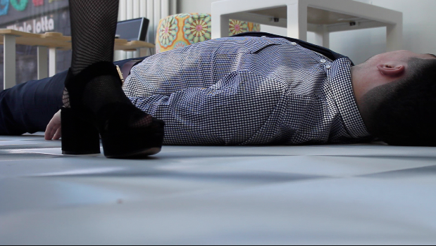
Our first attempt at shooting the death scene was shot at Maddie Hodges house. We had set it up to be some kind of Restaurant/Bar. We had flowery stools and the table had a flower design on them. This was to indicate the theme of the Wolf's bane. However, it didn't come across this way. It was still successful in some ways, such as the camera angles, the lighting and positioning. The high-key lighting helped to make everything look quite slick and the costumes were contrasted nicely against the white walls and flooring.


However, the Mise-en-Scene didn't work, as it wasn't suggestive of the genre since it resembled two people going to the café during the day, instead of two adults meeting for drinks of an evening. Overall, this resulted in it lacking tension and narrative enigma. We used Kaan Gunduz as the Male Victim as he fit the character description well and his performance was successful within the shots. However, everything will need be re-shot once we decide on a different location that will create a more sophisticated setting.


Test footage:


Budget:

The budget that we have decided on is $40 million. This could be seen as quite high in comparson to budgets in this genre. However, we feel it would be necessary since the Actors that we have playing the roles have a lot of star power. The location of the film is New York and the lead protagonist lives in a high end apartment which would cost a lot to rent out. Not to mention, the prices of props and costumes that will be needed.

Cast:


Mother/"Mrs. Cloutier" - Sharon Stone
Because of Sharon's age, she could fulfil the motherly role for our film. Also, because of her role in Basic Instincts (1992), she has been linked to this genre before and would reprise the role of her mother well.


Father/"Mr. Cloutier" - Tom Hanks
We chose Tom Hanks due to his previous fatherly roles in films such as Forrest Gump (1994) and much more serious-toned films such as The Da Vinci Code (2006), Tom Hanks understanding of both genres would lead to an entertaining performance in Woman's Bane.


Female lead/"Violet Cloutier" - Gal Gadot
Gal Gadot is a rising star, with her role in Batman VS Superman (2016) and her upcoming role as Wonder Woman in (2017). Also, she is beautiful, which would make it easy for her victims to fall in love with her.


Detective - Morgan Freeman
Morgan Freeman has played many detective roles before, for example in Se7en (1995). He is known for being a serious actor and reprises the roles well.


Victim - Adam Gregory
Adam Gregory is a relatively attractive man who would fit the role well of being murdered, due to the fact Violet attracts good looking men. Adam is also an upcoming star, having featured in films like 17 Again (2009).

Audience Profile

the mirror scene

For this shoot we had to buy a mirror, since none of us already had one that would work in the scene. Due to it being brand new the white frame was a lot cleaner compared to the white screen and showed the difference in two colours. However, this should be able to be corrected when editing. While this shot is going to be have the black and white effect on  it, we are still planning on isolating the colour of the name (Gal Gadot) that will be written.


The mirror scene has been the hardest scene to shoot so far. This is because we had to create a white background for around the mirror but also for in the reflection of the mirror. As well as this, it was extremely difficult for Maddie Brownlow (the cinematographer) to film from the angle that we wanted, without her being visible in the reflection of the mirror.


Previously, we had tested out how we wanted the name to be written and we came to the decision that Kelly's handwriting was the best suited. Therefore, in the shot we had most of the name already written and I just had to finish of writing the T. This helped to keep my interaction with the mirror quite short so that once I exit the scene, the time in which the camera is still focused on the mirror can be lengthened, without becoming boring, to make sure the actors name is made prominent.


Typography for Mirror Scene

Ahead of shooting the mirror scene, we practiced each writing the actors name in lipstick to decide which handwriting would best suit the character. we decided upon Kelly's handwriting because it is quite stylised but also sophisticated. We used purple lipstick when practicing writing the name. However, when it is actually shot we are planning on using dark red lipstick for the connotations that red conveys such as lust and danger. Which, is an accurate way to represent the protagonist.

The style of writing we decided on:

Monday, 13 March 2017

First Screening


This is the first draft that we showed to the class, there are many gaps and it only includes the shots in front of the white screen. Moreover, there are many changes needed within length and the timings of the shots.

Sunday, 19 February 2017

Test shot 2:

Before we tested out this shoot, we needed to make the props. Therefore, we had to melt the lipsticks, this had health risks because the lipsticks were so small. Therefore, the plastic would also start to melt and it was very easy to burn yourself. Another difficulty that we came across was that it was hard to get the height of the lipsticks even and the way in which they melted created quite a messy finishing product.


This shoot didn't go according to how we had planned. When watching it back it was clear that the camera hadn't entirely been focussed. As well as this, I feel as though the angle and positioning didn't work as it appears quite unnatural in terms of the way it fits in the frame. I also think the pace is too slow which makes it feel quite dull. Therefore, it will need to be re-shot in order to be included in our Title Sequence.

Test shoot:


Before we started to shoot we wanted to experiment in terms of the lighting and angles that we should use.  This resulted in us doing a test shoot while we created some props that would be featured in our sequence. In which we melted red lipstick but made it appear as if it was blood. This is a way to represent the femininity of the character while connoting quite sinister aspects. This is because red is quite a controversial colour as it can represent Sexuality, love and lust but also connote danger, death and fear.


We only used one light box due to the location in which we were filming and the resources we had at the time and since we couldn't get the cable for the light box to reach far enough,  the lighting source was on the right side. Therefore, in the shoot the lighting was uneven. However, this was helpful in telling us that when we next shoot in front of the white screen we would need to use two light box's on either side of the white screen so that the lighting is balanced.

Friday, 17 February 2017

Different Typography Styles:

Different Typography styles:

Nite Club:
Hermione:


Dolphian:

Ornamental Versals:
20db:

These are the different typography styles that I think would work best for the title of our film, the first four are quite similar in the style. However, I think the first one Nite Club is the most sophisticated.